| Author |
Message |
lucius
DarkXL Developer

Joined: 17 Feb 2008
|
 Posted: Jun 12, 2008 09:47 Post subject: DarkXL Icon & Logo Posted: Jun 12, 2008 09:47 Post subject: DarkXL Icon & Logo |
    |
|
Its time to ask for community assistance again, we need to have a nice icon / logo for DarkXL.
I'd like to ask the community to come up with ideas and even better icons/logos. Then I'll use the best one for DarkXL, giving credit to the creator of course. Anyone can participate 
Each version of the logo/icon should all have similar "broad-stroke" features and be recognizable as the same "thing." Of course larger versions should have more detail.
These versions are required:
1) A recognizable, although much less detailed 16x16 small icon that shows up on the title bar of DarkXL when running.
2) Larger icon versions - 32x32 and 48x48 for the desktop or folder views.
3) A larger, more detailed version that could be used in documentation and website pages as a logo.
Feel free to post screenshots of your icons/logos with any description you want or to ask any questions. I may choose the one I feel is the best myself if there are only a few entries or if there are enough entries make a poll where you guys can vote on several top contenders.
_________________
DarkXL....http://darkxl.wordpress.com
Last edited by lucius on Jun 17, 2008 20:08; edited 1 time in total |
|
The MAZZTer
Death Star

Joined: 25 Sep 2003
|
| Posted: Jun 12, 2008 15:42 Post subject: |
|
|
Might I recommend entries be submitted in 256x256 PNG/XCF/PSD format? If it scales down well enough other sizes wouldn't be a necessity, although if they don't the author might wanna tweak them himself and submit separate sizes.
And add another entry to bring us into the 21st century!
4) 256x256 PNG for Vista icons. 
It's a bit hard to find good tools to manage icons with Vista PNG icons in them, but this should make things easier. Should be able to take individual .icos and a .png and spit out the .ico file for compiling. If you're not comfortable with .NET I could write a tool to do it easy, since it doesn't look like the demo project uses the assemble icons part of the library at all.
I can't draw so I'm not going to even try submitting anything myself. Sorry. 
Here are the original icon files from my DF CD:

32x32 4-bit

32x32 8-bit

Multiicon with both of the above in one .ico
_________________
http://www.mzzt.net/ | I am a respectable admin with a respectable sig. |
|
lucius
DarkXL Developer
Joined: 17 Feb 2008
|
| Posted: Jun 12, 2008 17:48 Post subject: |
|
|
The_Mega_ZZTer wrote:
Might I recommend entries be submitted in 256x256 PNG/XCF/PSD format? If it scales down well enough other sizes wouldn't be a necessity, although if they don't the author might wanna tweak them himself and submit separate sizes.
And add another entry to bring us into the 21st century!
4) 256x256 PNG for Vista icons.
It's a bit hard to find good tools to manage icons with Vista PNG icons in them, but this should make things easier. Should be able to take individual .icos and a .png and spit out the .ico file for compiling. If you're not comfortable with .NET I could write a tool to do it easy, since it doesn't look like the demo project uses the assemble icons part of the library at all.
I can't draw so I'm not going to even try submitting anything myself. Sorry.
Here are the original icon files from my DF CD:
...
Multiicon with both of the above in one .ico
Supplying a 256x256 PNG for a Vista icon is a good idea, although the larger logo version could be used for this as well.
As for making one image then relying on image scaling - I don't think that would get good results for many images, especially at 16x16. I'd prefer that the author's posted all the requested sizes. However if they can make the sizes by simply scaling the images then that's fine - as long as it looks good. Thanks for the response and advice.
If anyone else is working an icon / logo feel free to post that here even if you have nothing to show yet. It would be nice to get some idea how many candidates there are likely to be. And of course any other comments are welcome.
Thanks everyone 
_________________
DarkXL....http://darkxl.wordpress.com |
|
Gez
Gamorrean
Joined: 05 May 2008
|
| Posted: Jun 12, 2008 23:31 Post subject: |
|
|
Concept prototype in many sizes... Nothing wonderful, but more starwarsy than Time New Roman.
128, 64, 48, 32, 16. In PNG format.
    
|
|
lucius
DarkXL Developer
Joined: 17 Feb 2008
|
| Posted: Jun 13, 2008 00:54 Post subject: |
|
|
Thanks for the submission Gez. I appreciate the time and effort but I do have a few comments:
The icon is not replacing the DarkXL title text in the titlescreen. It is meant to be an iconic representation, rather then a title. Take for example the "E" icon in internet explorer or Windows flag icon. Or even the Doomsday Engine icon (http://www.doomsdayhq.com), which can be blown up and still look like a good recognizable logo.
Also the 16x16 version of the icon should be recognizable and clean looking. This probably means that the "broad strokes" features of the icon/logo should be simpler and more symbolic. In fact maybe starting with something that looks good in 16x16 then making larger versions that look even better and more detailed is the way to go.
Again, thanks for the submission - I appreciate the effort. Feel free to tweak what you have or try again. Any other comments are welcome and of course more submissions.
_________________
DarkXL....http://darkxl.wordpress.com |
|
Burning Gundam
Kell Dragon
Joined: 28 Sep 2003
|
| Posted: Jun 13, 2008 02:26 Post subject: |
|
|
I was thinking it should be based from the Bryar Pistol or the head of a Dark Trooper. But I like the Iconic Stormtrooper head most to be honest.
_________________
I don't think outside the box... I customize it. |
|
The MAZZTer
Death Star
Joined: 25 Sep 2003
|
|
Magic_Al
Gamorrean
Joined: 22 Mar 2005
|
| Posted: Jun 13, 2008 05:18 Post subject: |
|
|
I'm a Mac guy so I have no idea how Windows icons are formatted but I'm sure someone can convert these PNGs.
Because DarkXL replaces the Dark Forces executable, if DarkXL doesn't use the Dark Forces icon, that part of the original user experience wouldn't be preserved. (At least it was part of the experience on the Mac, I don't know if the DOS version had an icon for Windows or not.) Here's a 256x256 24-bit version of the original Dark Forces icon. The source is the Mac DF demo's 8-bit BUYIT.BM image, which I smoothed out and cropped like the original 32x32 Mac application icon.
   
To reflect the idea of bringing Dark Forces into the 21st Century, here's the icon in a Web 2.0/iPhone glossy style. It's kind of slick but it feels a little anachronistic for what we're doing.
   
Star Wars has very simple logo graphics and Dark Forces is from an earlier era of computer games, so I think it's good not to get too fancy. Here's a simple DarkXL logo against a Hubble starfield, and a matching branded version of the Dark Forces icon. I avoided the Star Wars font to be different but anyone will know DarkXL is Star Wars-related.

   
Bonus: if anyone wants it, here's the Mac DF demo's BUYIT.BM image.

Well that was fun. I haven't made anything Dark Forces-related in a while!
_________________
----- MagicAl`s DARK FORCES Niche -----
http://homepage.mac.com/anewmanagn/magic_al/
Armed only with a blaster pistol and an intimate knowledge of
Imperial methods, MagicAl prepares to go to lunch....
Last edited by Magic_Al on Jun 14, 2008 01:47; edited 1 time in total |
|
lucius
DarkXL Developer
Joined: 17 Feb 2008
|
| Posted: Jun 13, 2008 07:10 Post subject: |
|
|
Magic_Al, the first one is certainly a contender. Do you think it would look good if the background behind the Stormtrooper was cutout or atleast part of it so that the bigger versions of the icon weren't totally rectangular? Anyway its the best contender so far but I'm open to others trying as well.
I don't really think the "sheen" on the second set is quite right especially in the smaller icons. Its probably too strong.
I'm afraid that I'm not a big fan of the other icons and DarkXL logo below that, sorry.
Anyway thanks for the work and good job.
More submissions or comments are welcome.
_________________
DarkXL....http://darkxl.wordpress.com |
|
Burning Gundam
Kell Dragon
Joined: 28 Sep 2003
|
| Posted: Jun 13, 2008 07:14 Post subject: |
|
|
I agree, I was leaning more towards the second but the sheen does need to be a bit lighter.
_________________
I don't think outside the box... I customize it. |
|
Weregoose
Gamorrean
Joined: 05 May 2008
|
| Posted: Jun 13, 2008 07:25 Post subject: |
|
|
It's a shame that I can't get this to resize properly, but here is a concept logo:

Will keep trying.
|
|
Gez
Gamorrean
Joined: 05 May 2008
|
|
The MAZZTer
Death Star
Joined: 25 Sep 2003
|
| Posted: Jun 13, 2008 14:00 Post subject: |
|
|
It also happens to be art publicly available on the web (see my link) and no-one seems to be too broken up about that down in LucasArts-ville.
Magic Al's icons are the best so far IMO, but I think it would look better if it was circular, like the original icon. Also less Web 2.0... the shadow would look better as a softer, 8-bit transparency shadow. Also less shiny, it overwhelms the icon imo.
_________________
http://www.mzzt.net/ | I am a respectable admin with a respectable sig. |
|
Magic_Al
Gamorrean
Joined: 22 Mar 2005
|
| Posted: Jun 13, 2008 14:53 Post subject: |
|
|
I don't mind if this is the most popular, it's my strong favorite.
Circle vs. square: It's square because the Macintosh version's icon is square and all I did is recreate it at higher resolution and bit-depth. There was also a circle icon but on the Mac it represented the CD (because mounted volumes appear on the Mac OS desktop). If being square sets it apart from the "original" circle from the PC users' point of view, maybe that's just what DarkXL needs.
LucasArts Mac DF icon (for comparison only): 
The Mac version also had folder icon and file icons for GOB and LFD files. These were regular Mac OS system icons with the head of the in-game stormtrooper sprite centered on them, so that's another idea.
LucasArts Mac DF folder icon (for concept only, should be redone with Windows OS or generic folder background): 
_________________
----- MagicAl`s DARK FORCES Niche -----
http://homepage.mac.com/anewmanagn/magic_al/
Armed only with a blaster pistol and an intimate knowledge of
Imperial methods, MagicAl prepares to go to lunch....
Last edited by Magic_Al on Jun 14, 2008 01:47; edited 1 time in total |
|
The MAZZTer
Death Star
Joined: 25 Sep 2003
|
| Posted: Jun 13, 2008 18:31 Post subject: |
|
|
Whenever I see a square icon, my first thought is that whoever made it couldn't figure out how to do transparency. Granted, yours doesn't look like someone just painted white instead of transparency on it, but still...
http://www.ctrlaltdel-online.com/favicon.ico
http://www.dilbert.com/favicon.ico
http://www.garfield.com/favicon.ico
I think other shapes, especially more complex ones, look like they integrate better with the desktop or a menu or whatever. Maybe ditching the circle idea and just making the stormtrooper's head have a transparent background would look even better. I don't know.
Using a Dark Trooper head (phase 2 or 3) instead also seems like an interesting parallel.
_________________
http://www.mzzt.net/ | I am a respectable admin with a respectable sig. |
|
Magic_Al
Gamorrean
Joined: 22 Mar 2005
|
| Posted: Jun 13, 2008 21:04 Post subject: |
|
|
The_Mega_ZZTer wrote:
Whenever I see a square icon, my first thought is that whoever made it couldn't figure out how to do transparency. Granted, yours doesn't look like someone just painted white instead of transparency on it, but still...
I know what you mean, but the historian in me says the square icon was LucasArts' creative decision for the Mac version of Dark Forces, and in the context of a pre-Windows 95 game, the Mac version should be considered definitive of LucasArts' best efforts in desktop GUI presentation. If we're talking about aesthetics, I can certainly make a circle version and a knock-out version to consider. I also have one more idea for a non-LucasArts icon. I have company this weekend but I'll see what I can do when I get a chance.
_________________
----- MagicAl`s DARK FORCES Niche -----
http://homepage.mac.com/anewmanagn/magic_al/
Armed only with a blaster pistol and an intimate knowledge of
Imperial methods, MagicAl prepares to go to lunch.... |
|
lucius
DarkXL Developer
Joined: 17 Feb 2008
|
| Posted: Jun 13, 2008 21:35 Post subject: |
|
|
Magic_Al wrote:
The_Mega_ZZTer wrote:
Whenever I see a square icon, my first thought is that whoever made it couldn't figure out how to do transparency. Granted, yours doesn't look like someone just painted white instead of transparency on it, but still...
I know what you mean, but the historian in me says the square icon was LucasArts' creative decision for the Mac version of Dark Forces, and in the context of a pre-Windows 95 game, the Mac version should be considered definitive of LucasArts' best efforts in desktop GUI presentation. If we're talking about aesthetics, I can certainly make a circle version and a knock-out version to consider. I also have one more idea for a non-LucasArts icon. I have company this weekend but I'll see what I can do when I get a chance.
Feel free to make multiple submissions, including the circle and knock out and the non-LucasArts icon if you want. At a certain point I'll do a poll that'll feature the best several choices - if there's enough to choose from... 
_________________
DarkXL....http://darkxl.wordpress.com |
|
Magic_Al
Gamorrean
Joined: 22 Mar 2005
|
| Posted: Jun 14, 2008 01:45 Post subject: |
|
|
Circle version, based on the icons The_Mega_ZZTer posted:
   
_________________
----- MagicAl`s DARK FORCES Niche -----
http://homepage.mac.com/anewmanagn/magic_al/
Armed only with a blaster pistol and an intimate knowledge of
Imperial methods, MagicAl prepares to go to lunch....
Last edited by Magic_Al on Jun 14, 2008 13:18; edited 3 times in total |
|
The MAZZTer
Death Star
Joined: 25 Sep 2003
|
| Posted: Jun 14, 2008 02:32 Post subject: |
|
|
<3
_________________
http://www.mzzt.net/ | I am a respectable admin with a respectable sig. |
|
Tsophika
Gamorrean
Joined: 14 Jan 2008
|
| Posted: Jun 14, 2008 08:40 Post subject: |
|
|
My vote is for an alpha channel. Not Win, not Mac, but something new.
   
Or maybe something a little different altogether. The former is my preference, however.
   
Last edited by Tsophika on Jun 17, 2008 08:23; edited 1 time in total |
|
lucius
DarkXL Developer
Joined: 17 Feb 2008
|
| Posted: Jun 14, 2008 08:59 Post subject: |
|
|
Cool, so we have 3 possible entries so far. All 3 will be put up for vote but the floor is still open for more entries - keep them coming 
_________________
DarkXL....http://darkxl.wordpress.com |
|
Weregoose
Gamorrean
Joined: 05 May 2008
|
| Posted: Jun 14, 2008 15:10 Post subject: |
|
|
  
The larger version is both beautiful and horrible to look at, since it shows greater detail, but at the same time reveals just how much of a hack job this was. You were warned.
|
|
Tsophika
Gamorrean
Joined: 14 Jan 2008
|
| Posted: Jun 15, 2008 12:10 Post subject: |
|
|
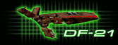
Here's a Dark Trooper as suggested by someone.
   
Last edited by Tsophika on Jun 17, 2008 08:41; edited 1 time in total |
|
lucius
DarkXL Developer
Joined: 17 Feb 2008
|
| Posted: Jun 15, 2008 16:06 Post subject: |
|
|
Thanks for the submissions so far
I'm planning on putting up a poll on Tuesday night, so please have any additional submissions in by then. I will be choosing what I consider the 4 best and then the community can decide on the final icon.
If anyone is working on anything and needs more time, let me know.
_________________
DarkXL....http://darkxl.wordpress.com |
|
Tsophika
Gamorrean
Joined: 14 Jan 2008
|
| Posted: Jun 17, 2008 08:19 Post subject: |
|
|
My last submission. Kind of hard to see at the smallest resolution.
   
|
|
The MAZZTer
Death Star
Joined: 25 Sep 2003
|
| Posted: Jun 17, 2008 16:00 Post subject: |
|
|
The "alpha channel" ones with the stormtrooper especially are  , however the top of his head is cut off which is . Also they all end up squarish on the bottom... I was envisioning just the head with no shoulders or torso. I'd try it myself but I'm not a graphics person, I wouldn't know where to start. , however the top of his head is cut off which is . Also they all end up squarish on the bottom... I was envisioning just the head with no shoulders or torso. I'd try it myself but I'm not a graphics person, I wouldn't know where to start.
_________________
http://www.mzzt.net/ | I am a respectable admin with a respectable sig. |
|
lucius
DarkXL Developer
Joined: 17 Feb 2008
|
| Posted: Jun 17, 2008 20:05 Post subject: Vote in the poll! |
|
|
Please vote in the poll thread for your favorite icon / logo set. Thanks everyone for the submissions.
_________________
DarkXL....http://darkxl.wordpress.com |
|
Emon
Ree-Yees
Joined: 10 Aug 2007
|
| Posted: Jun 21, 2008 19:03 Post subject: |
|
|
I know the poll is already going, but I'm going to suggest a variant anyway. This is the same stormtrooper cutout as above but with the red tint removed. The red tint doesn't make much sense when you can't see the blaster fire that is creating it. People are used to seeing white stormtroopers, anyway.

|
|
Magic_Al
Gamorrean
Joined: 22 Mar 2005
|
| Posted: Jun 23, 2008 05:01 Post subject: |
|
|
I got Mac DF (sort of) running in emulation so I thought I'd grab all its icons to show as reference in case DarkXL might have folder and data file icons.
Top to bottom they are: CD, Application, Folder, and Data File.

The 16x16 Application icon is inconsistent but that's actually what they did, probably so you can still tell it's a stormtrooper at that size.
_________________
----- MagicAl`s DARK FORCES Niche -----
http://homepage.mac.com/anewmanagn/magic_al/
Armed only with a blaster pistol and an intimate knowledge of
Imperial methods, MagicAl prepares to go to lunch.... |
|
sweatervest
Ree-Yees
Joined: 22 Apr 2008
|
|
|