| Author |
Message |
Magic_Al
Gamorrean
Joined: 22 Mar 2005
|
|
klasodeth
Trandoshan
Joined: 03 Mar 2008
|
 Posted: Jun 20, 2008 23:02 Post subject: Posted: Jun 20, 2008 23:02 Post subject: |
   |
|
Point taken.
I do wonder how the Dark Trooper would look if it the image was significantly larger and basically placed in a layer behind all the other characters, almost as a threat looming over everyone. That might keep it on the darker side and keep it from looking too ghostly.
|
|
Magic_Al
Gamorrean
Joined: 22 Mar 2005
|
|
Ryuichi91
Ree-Yees
Joined: 06 Aug 2007
|
| Posted: Jun 21, 2008 02:07 Post subject: |
|
|
I'd say that pic looks pretty cool so its got my vote
|
|
Tsophika
Gamorrean
Joined: 14 Jan 2008
|
| Posted: Jun 21, 2008 03:41 Post subject: |
|
|
I've got a screen I'm working on. I'll get it up soon, lucius.
|
|
lucius
DarkXL Developer

Joined: 17 Feb 2008
|
|
Pumpkinetics
Ree-Yees
Joined: 16 Oct 2007
|
| Posted: Jun 21, 2008 09:22 Post subject: |
|
|
I'm also working on one, although I have a basic demo version if anyone wants to see:
url=http://s15.photobucket.com/albums/a364/Pumpkinetics/Miscellaneous/?action=view¤t=DarkXLlauncherproto.png] [/url] [/url]
(Click for notes)
_________________
"So, how goes (X) ?"
"WORKIN' ON IT! I SWEAR!" |
|
Pumpkinetics
Ree-Yees
Joined: 16 Oct 2007
|
| Posted: Jun 21, 2008 11:47 Post subject: |
|
|
I'm also working on one, although I have a basic demo version if anyone wants to see:
(Click for notes)
(GAH! ccidental double post! Could someone with mod powers please remove my first post?)
_________________
"So, how goes (X) ?"
"WORKIN' ON IT! I SWEAR!"
Last edited by Pumpkinetics on Jun 21, 2008 21:53; edited 2 times in total |
|
The MAZZTer
Death Star

Joined: 25 Sep 2003
|
| Posted: Jun 21, 2008 14:41 Post subject: |
 |
|
I assume it will have more than three colors when you're done with it?
_________________
http://www.mzzt.net/ | I am a respectable admin with a respectable sig. |
|
sheepandshepherd
Trandoshan
Joined: 01 Apr 2008
|
| Posted: Jun 21, 2008 16:48 Post subject: |
|
|
Magic_Al wrote:
So now we have another choice.

EDIT: another variation of this would put the menu buttons stacked vertically in the middle of the lens flare, maybe leave out the ships. It might also look good to do the logo in solid red because the silver/tan logo doesn't stand out from the grayness in this compared to my other design.
Hmmm . . . I like it . . . Not sure about the menu buttons, though, I wouldn't want them in the middle of everything . . . but I agree, the title text should be more red and less pink . . . experiment a little with gradients and see which would look the best in your opinion.
Pumpkinetics, the Dark Trooper/Imperial logo is a good idea, but I agree that it should be a little more detailed . . . Maybe you could have a sort of "group photo" of all three phases of Dark Troopers 
Also, with your basic layout it may be better to use different menu buttons besides the DF style buttons, they wouldn't fit in at all . . .
|
|
Magic_Al
Gamorrean
Joined: 22 Mar 2005
|
| Posted: Jun 21, 2008 20:21 Post subject: |
|
|
Revised with alternate button placement and miscellaneous polishing.


_________________
----- MagicAl`s DARK FORCES Niche -----
http://wayback.archive.org/web/*/http://homepage.mac.com/anewmanagn/magic_al/
Armed only with a blaster pistol and an intimate knowledge of
Imperial methods, MagicAl prepares to go to lunch.... |
|
Gez
Gamorrean
Joined: 05 May 2008
|
| Posted: Jun 21, 2008 22:00 Post subject: |
|
|
Magic_Al wrote:
Creative decision. All the characters are still transparent (mostly) but the stars were removed because they lacked context to be understood as background and came across as foreground blemishes. The planet doesn't have that problem. It doesn't make consistent physical sense but we're talking about an abstract composition. So, no.
Okay, but then what about lowering Jabba a bit so that there's no longer a part of his head that gets cut off by the sudden color change?
|
|
sheepandshepherd
Trandoshan
Joined: 01 Apr 2008
|
| Posted: Jun 21, 2008 22:23 Post subject: |
|
|
Magic_Al wrote:
Revised with alternate button placement and miscellaneous polishing.
Awesome, I like it. Especially the redness around the DT's head. I'm still not sure putting the buttons in the middle is a good idea though . . .
btw, where did you get that particular dark trooper? I like it, and I haven't seen many decent DT photos . . .
|
|
Weregoose
Gamorrean
Joined: 05 May 2008
|
|
Magic_Al
Gamorrean
Joined: 22 Mar 2005
|
| Posted: Jun 22, 2008 03:04 Post subject: |
|
|
To please the crowd, no more transparency, buttons back at the bottom.


_________________
----- MagicAl`s DARK FORCES Niche -----
http://wayback.archive.org/web/*/http://homepage.mac.com/anewmanagn/magic_al/
Armed only with a blaster pistol and an intimate knowledge of
Imperial methods, MagicAl prepares to go to lunch.... |
|
Pumpkinetics
Ree-Yees
Joined: 16 Oct 2007
|
| Posted: Jun 22, 2008 08:59 Post subject: |
|
|
Here's my semi-finalized version of my DXL title screen graphic- Suggestions for improvement welcome.

(Note: The buttons on the selection doodad, rather than highlighting green as in the game, simply depress. The light still flashes red, though. Also If anyone wants the base DXL logo as a bitmap or SVG I'd be happy to oblige)
Base art:

_________________
"So, how goes (X) ?"
"WORKIN' ON IT! I SWEAR!" |
|
Weregoose
Gamorrean
Joined: 05 May 2008
|
| Posted: Jun 22, 2008 13:08 Post subject: |
|
|
I'm curious what you think of this version:

With "Launch" being centered on (768,752) and the others lowered 32 and laterally shifted 192 in both directions.
(I'd be perfectly happy with the way it is without this suggestion.)
|
|
Magic_Al
Gamorrean
Joined: 22 Mar 2005
|
|
Magic_Al
Gamorrean
Joined: 22 Mar 2005
|
| Posted: Jun 23, 2008 07:14 Post subject: |
|
|
Freshly tweaked logo (many barely noticeable changes): 

And I got inspired by Pumpkinetics logo and did it old-school ESB-style (which totally doesn't go with his background):

_________________
----- MagicAl`s DARK FORCES Niche -----
http://wayback.archive.org/web/*/http://homepage.mac.com/anewmanagn/magic_al/
Armed only with a blaster pistol and an intimate knowledge of
Imperial methods, MagicAl prepares to go to lunch.... |
|
lucius
DarkXL Developer
Joined: 17 Feb 2008
|
| Posted: Jun 23, 2008 20:20 Post subject: |
|
|
Magic_Al wrote:
Freshly tweaked logo (many barely noticeable changes):
...
And I got inspired by Pumpkinetics logo and did it old-school ESB-style (which totally doesn't go with his background):
...
I prefer your first title myself - which looks really good by the way.
Now I was thinking about getting the poll started soon, can you post all the final mockups that you'd like to be considered? If its just one, that's fine but I get the feeling there are several alternatives you'd like to consider.
Is there anyone else still working on entries? If so please post so I don't start the poll without you.
Pumpkinetics, is your post final or are you still working on it? I know you said "semi-final" in your post, I'm just checking to make sure that didn't change. If you're still working on it, I'd suggest you remove the "GPU" if its not too much work. Not everyone knows what a GPU is and it seems redundant, which is why it was removed from the current title.
And I would need the title as a seperate file in addition to the title screen from the winner. I'm planning on using the title graphics on the website to replace the plain text that is there now.
Thanks for all the work.
_________________
DarkXL....http://darkxl.wordpress.com |
|
sheepandshepherd
Trandoshan
Joined: 01 Apr 2008
|
| Posted: Jun 23, 2008 21:27 Post subject: |
|
|
The tweaked first title is a little darker now, right? I like that better than the pinkish tint on the old version. And I agree, the first one (not the ESB style one) fits better to Magic_Al's current title screen.
Pumpkinetics - I think, like Magic_Al said, you should probably change the title text. I don't really know what would fit good with your background . . . and one more thing, the Imperial logo looks kind of wierd with the rounded shading, it might be better to make it more straight-edged . . . if you want to do that, of course
|
|
Tsophika
Gamorrean
Joined: 14 Jan 2008
|
| Posted: Jun 24, 2008 03:08 Post subject: |
|
|
I'll get my title up tonight... don't start without me!
|
|
Magic_Al
Gamorrean
Joined: 22 Mar 2005
|
|
sheepandshepherd
Trandoshan
Joined: 01 Apr 2008
|
| Posted: Jun 24, 2008 03:23 Post subject: |
|
|
Haha, I know, I just thought it was a little too light at first 
|
|
lucius
DarkXL Developer
Joined: 17 Feb 2008
|
|
Tsophika
Gamorrean
Joined: 14 Jan 2008
|
| Posted: Jun 25, 2008 08:31 Post subject: |
|
|
Work has kept me busy, but I finally have a title screen:

|
|
lucius
DarkXL Developer
Joined: 17 Feb 2008
|
| Posted: Jun 25, 2008 08:40 Post subject: |
|
|
Nice job Tsophika, that looks pretty good.
I was going to handle mods off the Options or settings screen but I could go directly to that dialog too. I haven't really worked on the mod options yet since they won't make it into the next build (except the command line already promised) so I'm flexible.
Do you have a full resolution version? And how do the buttons work (do they highlight, depress, etc.)? Would it be easy to change the screenshots used, some of those use the old hud font and old FOV?
_________________
DarkXL....http://darkxl.wordpress.com |
|
Tsophika
Gamorrean
Joined: 14 Jan 2008
|
| Posted: Jun 25, 2008 08:54 Post subject: |
|
|
The buttons will depress and text will glow blue. The buttons as well as the screens are easily interchangeable.
Finally, Imageshack has a 1.5MB limit, but the full TGA or PNG is available upon request.
|
|
lucius
DarkXL Developer
Joined: 17 Feb 2008
|
| Posted: Jun 25, 2008 09:13 Post subject: |
|
|
Tsophika, if I give you replacement shots for the 3 screenshots that use the old font, can you replace them? Would it be too hard to take "GPU" out of the subtitle, I'm thinking of removing it like the current title screen this would replace if it wins? If its too hard, then don't worry about it.
Other then that it looks good, I'll definitely include this in the poll. Thanks for all the hard work.
_________________
DarkXL....http://darkxl.wordpress.com |
|
Pumpkinetics
Ree-Yees
Joined: 16 Oct 2007
|
| Posted: Jun 25, 2008 10:39 Post subject: |
|
|
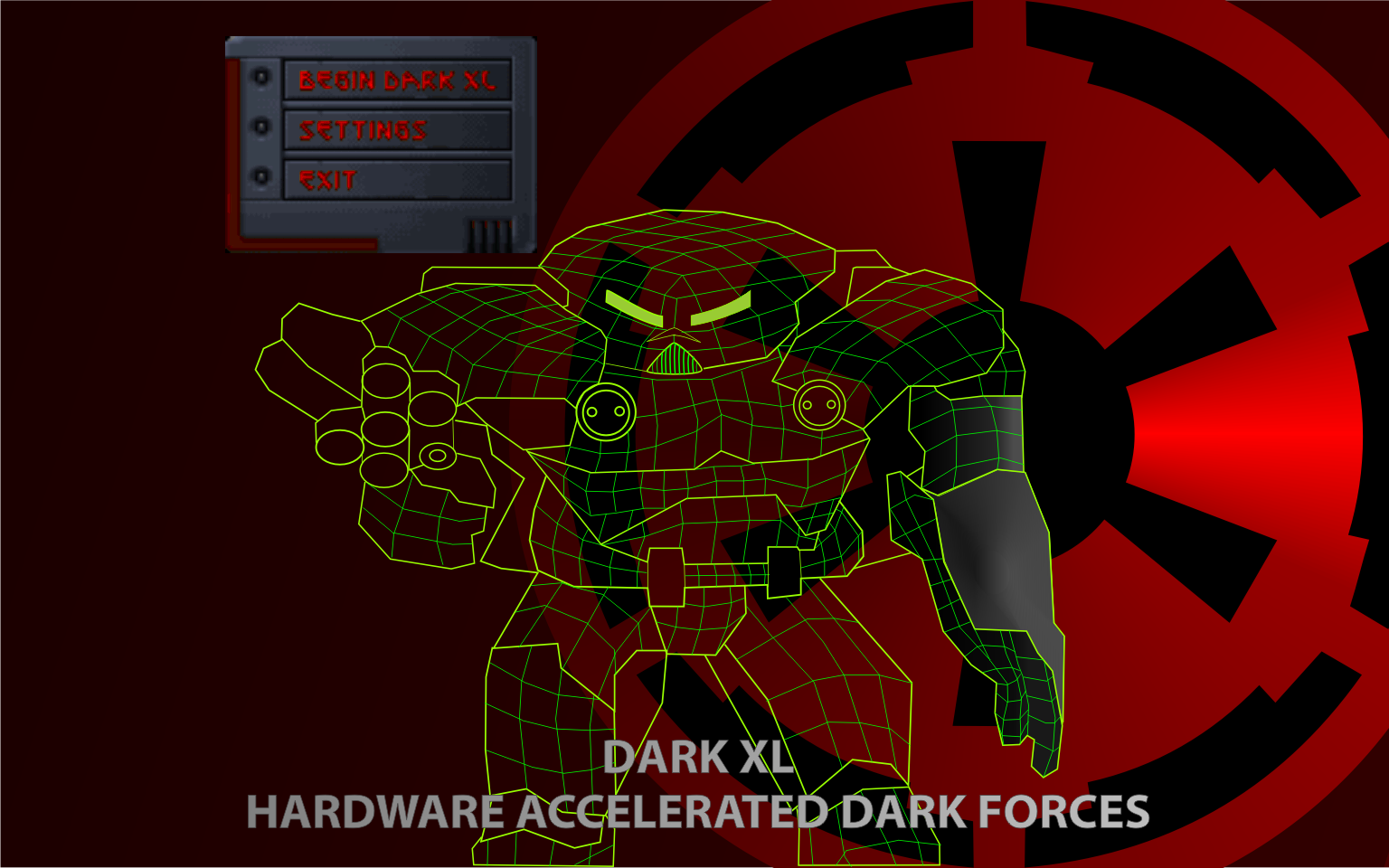
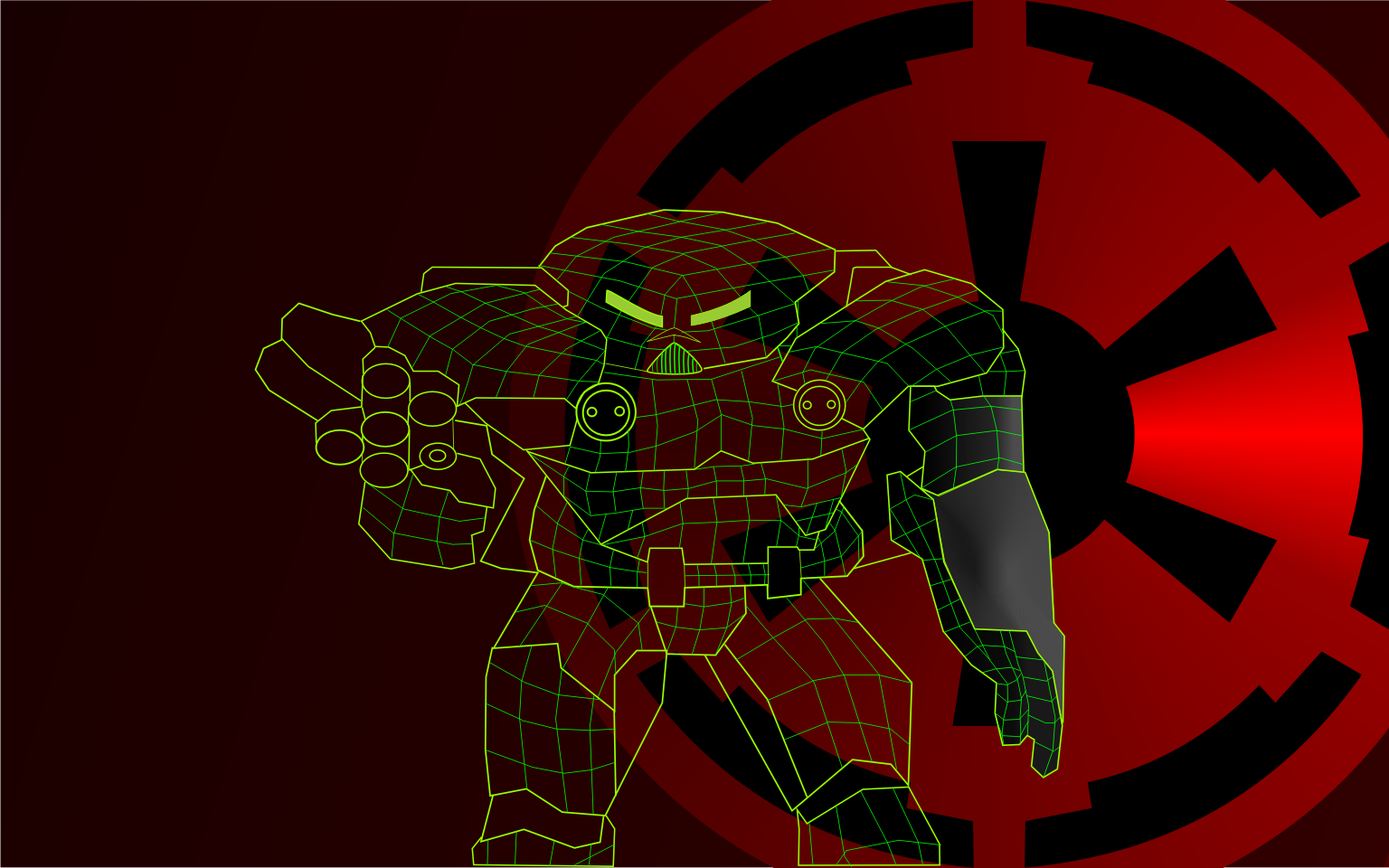
I finalized my submission, so here it is:
Composition:

Base art:

(Notes on changes: Adjusted wireframe, reverted imperial logo to red, changed DXL logo and SubText colour, Skewed DXL logo, changed "Gpu accelerated Dark forces extended" to "Hardware accelerated Dark Forces" [which seems a little more coherent], can change the text again if needed)
(EDIT: Got rid of the logo altogether for the mockup. It just didn't fit)
_________________
"So, how goes (X) ?"
"WORKIN' ON IT! I SWEAR!" |
|
|