Advanced Geometry and Texturing
Automatic Commits
Now that you've experienced making changes to the editor you are probably wondering if there was a way to automatically make the commits without always hitting the commit button (F3). Go ahead and bring up the Options menu with F9.
Switch to the Confirmations Tab and select the "Automatically Commit Changes" checkbox in the top right corner.
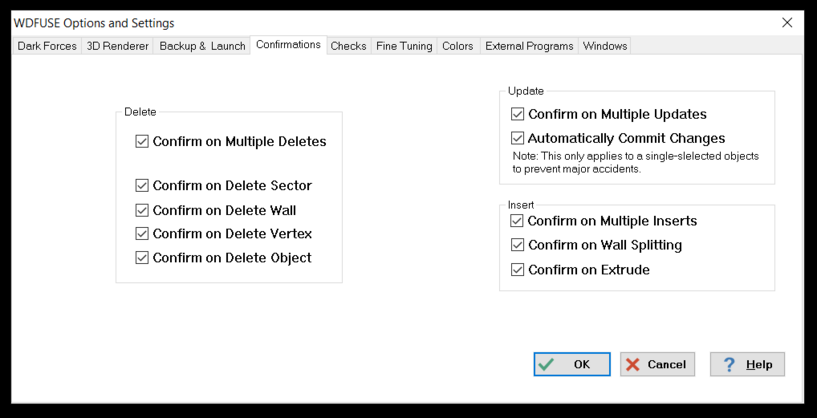
Now, every time you make a change it will be auto-committed and the 3D renderer will also be updated at once. Do note, this does not work on multiple map components at once as it is a dangerous operation.
Texturing Tutorial
Now lets jump to Room 5 . It is the with many textures and looks like this.
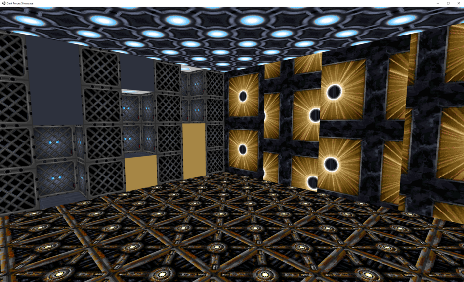
Here you will learn how texturing works in Dark Forces. Lets start by looking at the wall with 3 shelves that have gray and gold flat textures.
Top / Middle / Bottom
You may have noticed that in the Wall Editor there are four texture types. Top, Middle, Bottom and Sign. These describe which section of the Wall should be updated with a texture. In the vast majority of cases you would only need to update the Middle section. However, if the wall is adjoined to another wall then you may need to update the Top or the Bottom sections. Lets look below.
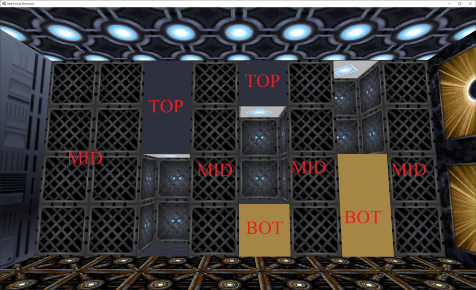
Lets number each texture column in front of us from 1 to 8. Notice that columns 1, 2 4, 6 and 8 all have the grate texture. Because they are not adjoined to the small shelves (holes) with the fan texture the only texture you are looking at is in the Middle section.
It is important to understand the the adjoined wall to the shelf sector always consumes the middle texture section. What would that mean for us?
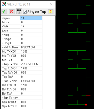
In column 3, the shelf is at the bottom. The shelf consumes the middle section because it is the adjoin. So the texture you are seeing above the adjoined section is the Top and is colored Grey. You can see in the image above that we do not see the IPSEC1.BM texture because it is consumed by the adjoin. We only see the top texture ZPGRYFIL.BM (GRAY)
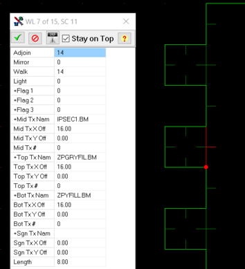
In column 5 the shelf is in the middle of the wall and consumes the middle adjoin section. Because we can see below the shelf we are looking at the Bottom section and it is colored Gold. We can also see above the middle shelf consuming the adjoin. So anything above is the Top section and the texture there is Grey. You can see in the image above that we do not see the IPSEC1.BM texture because it is consumed by the middle adjoin. We only see the top texture ZPGRYFIL.BM (GRAY) and the bottom texture ZPYFILL.BM (GOLD)
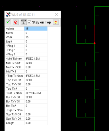
In column 7, the shelf is at the top. The shelf consumes the middle section because it is the adjoin. So the texture you are seeing below the adjoined section is the Bottom and is colored Gold. You can see in the image above that we do not see the IPSEC1.BM texture because it is consumed by the adjoin. We only see the bottom texture ZPYFILL.BM (GOLD)
Feel free to play around with the textures in here to make sure you understand the concept.
You may be wondering, What happens if a sector is adjoined to more than two shelves, which texture section do you assign? The answer is NONE! Dark Forces engine (JEDI) does not support room over room rendering. This feature is in Outlaws (JEDI v2.0).
Signs
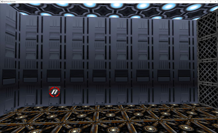
Now lets look at the southern wall with the red sign.
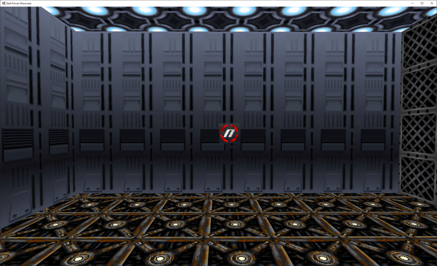
Signs are a special overlay texture for you wall. They always start at the bottom left corner of the wall and you move them around until they are in the place you want them to be. Signs in Nar Shaddaa mission are done this way as well as switches (More on this later).
You can change the X/Y positions of the sign from the Wall Editor. However, it is much faster to do it if you click on the Sign offsets in the Wall Editor and, while holding the Shift button, use the Arrow keys.
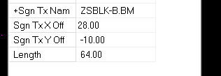
If you press Up while holding Shift the texture will go up and Down otherwise. The same for Left and Right arrow keys.
Go ahead and give it a try. It's a lot faster than typing the offsets with your keyboard.
Floors and Ceilings
Now lets look at the top and bottom of this sector. You may notice that the textures are not aligned.
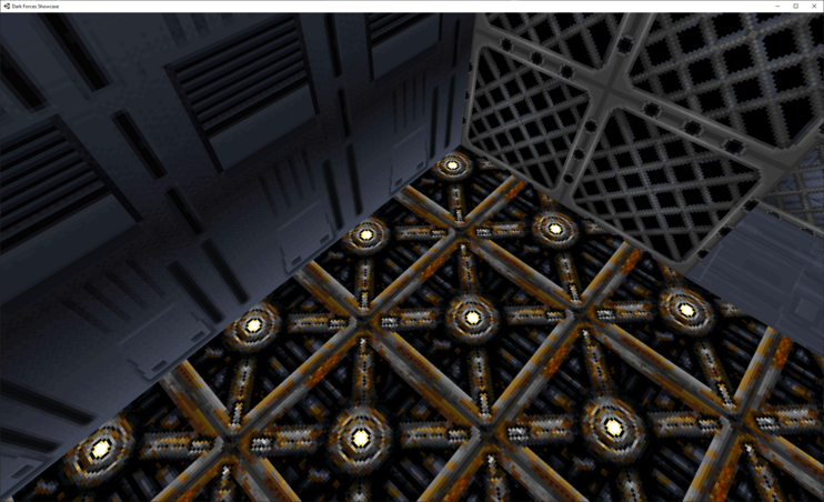
Lets make them even! Switch to Sector Mode and click on the Floor Texture X and Z Offsets.

Now, just like with the sign, use the Shift + Arrow Keys to align the floor textures so they are even.
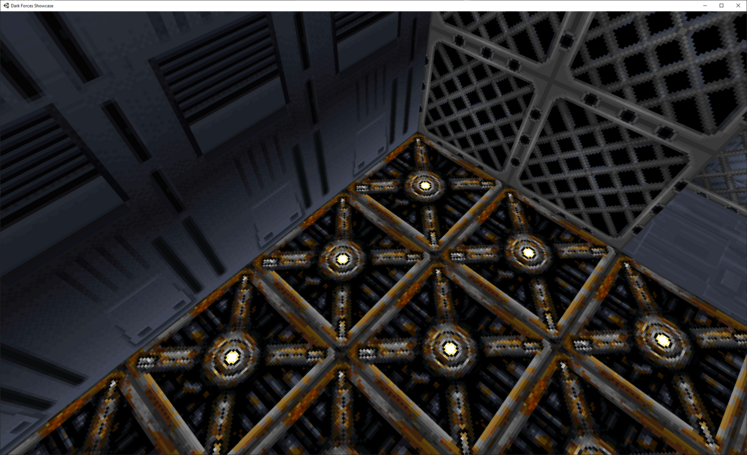
Much better!
The ceiling also looks a bit off!
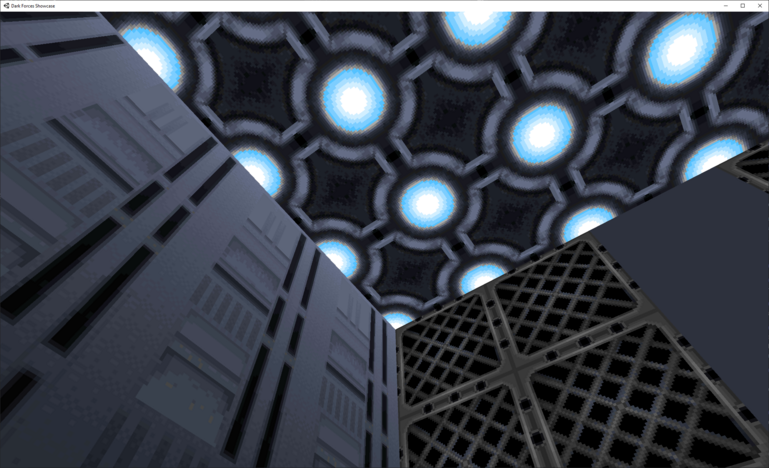
Now click on the X/Z offsets for the ceiling and align the ceiling texture just like you did the floor.
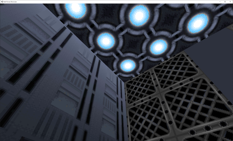
Now they both look good.
One important thing to remember with floor and ceiling textures is that they must be square and of size 8x8 (or 64x64 pixels). If you use any other texture they may look distorted!
Stitch Aligns
Now lets look at the north wall of this sector. It is a mess. I am sure you are not excited to align all those sections.
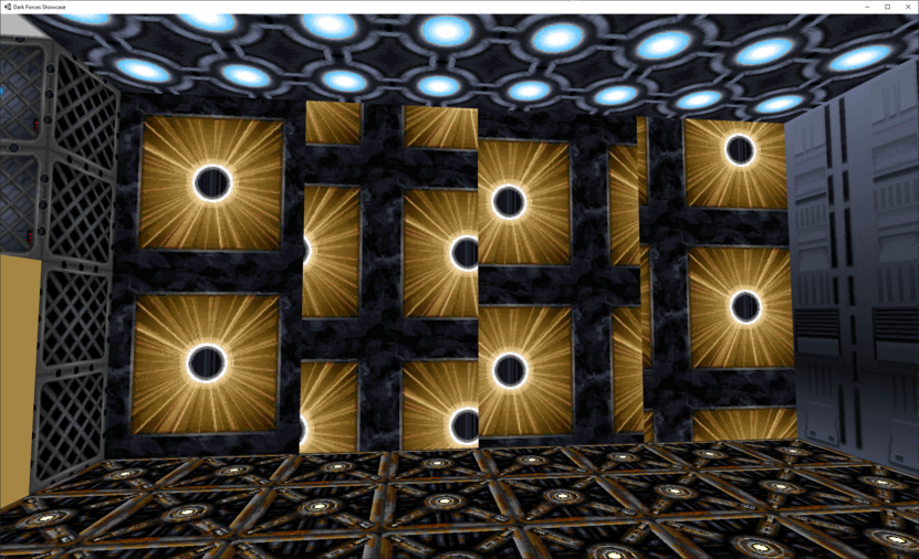
Fortunately, there is a tool called Stich that will automatically attempt to match the textures to the LEFT or RIGHT texture depending on what option you choose. Go ahead and switch to Wall Editor and Multiselect (with SHIFT) all the wall from left to right.
It should look like this in your editor.

Then right click on the wall and in the pop-up menu choose Stitch (Hotkey Shift+F5). This will automatically align all the texture and save you lots of time.
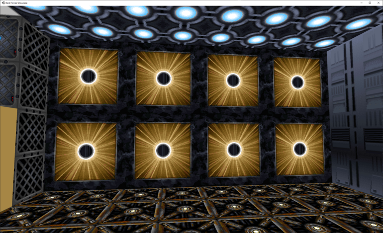
You can also reverse stitch from the right corner texture by choosing Reverse Stich option (or Shift+F6).
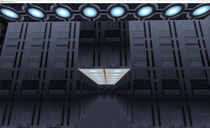
Pop quiz before you go - go ahead and align the texture over the passageway. Which Wall section should you update? Top, Middle or Bottom?
SubSectors
In Room 4 you will see a small square-shaped sector in the middle that is completely enclosed by the room's sector.
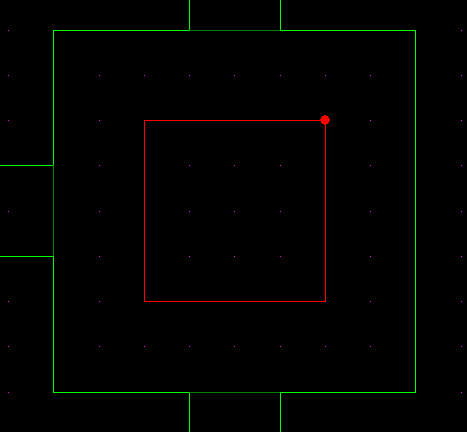
Sectors that are completely enclosed by another sector are called SubSectors. For example, the Detention Center's diamond-shaped moving platform is a subsector that is completely enclosed by the cliff sector.
With subsectors you can change the height to make either a pit or a platform. In this case you see a red platform.
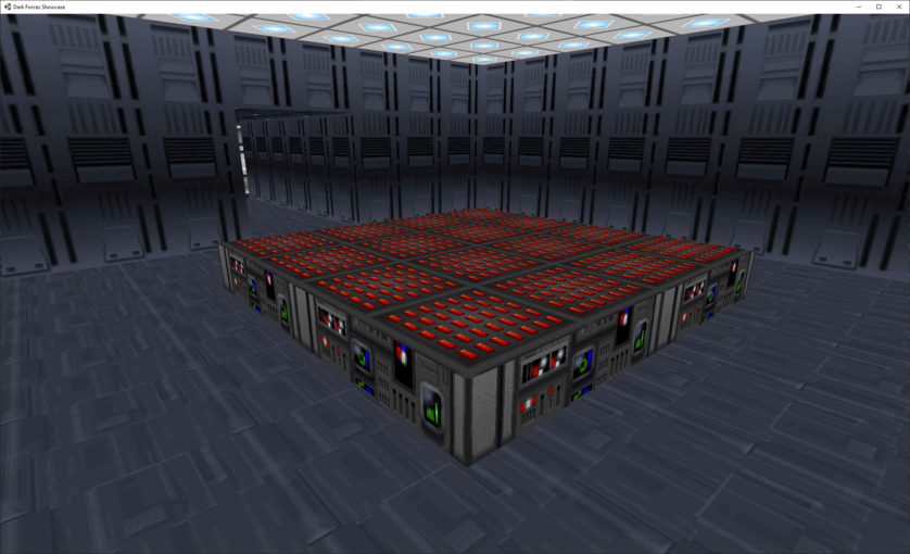
Select the Sector Editor and click on the subsector. Lets make it a pit instead! Change the Floor Altitude to -4.
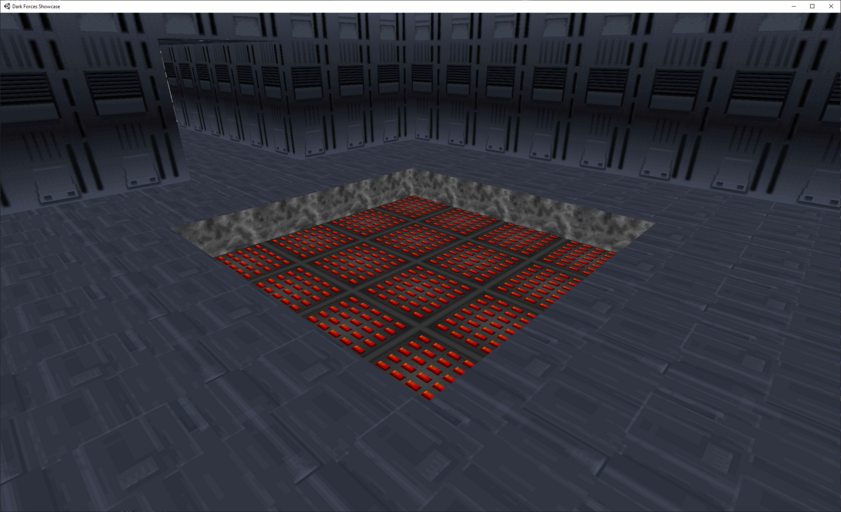
Now the SubSector is a pit. Now lets delete the subsector and see what happens.
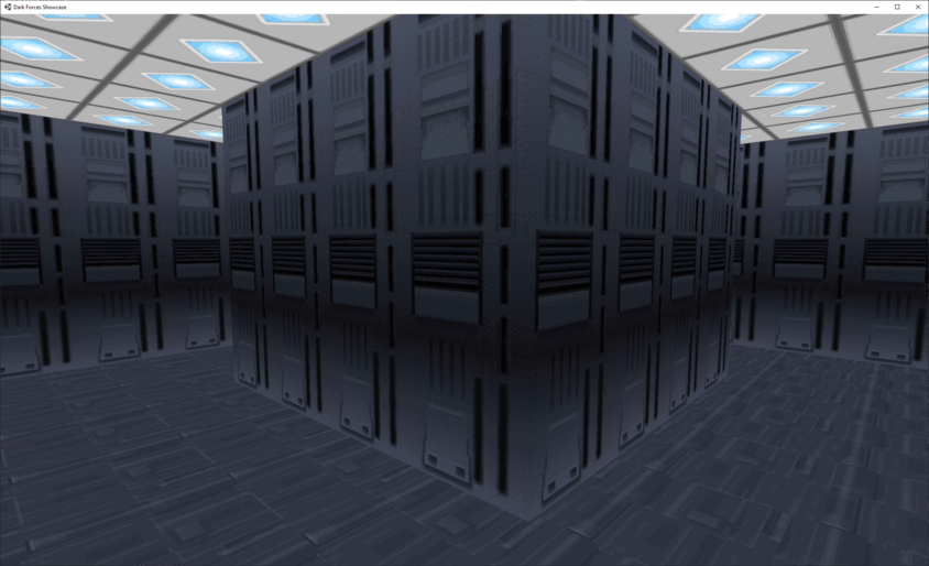
As you can see the subsector is gone and now all you see are walls. Deleting subsectors is a great way to make pillars in your rooms.
Now lets practice making subsectors. Go to Room 6 and select it. Go ahead and right click on this sector to bring up the pop-up menu.
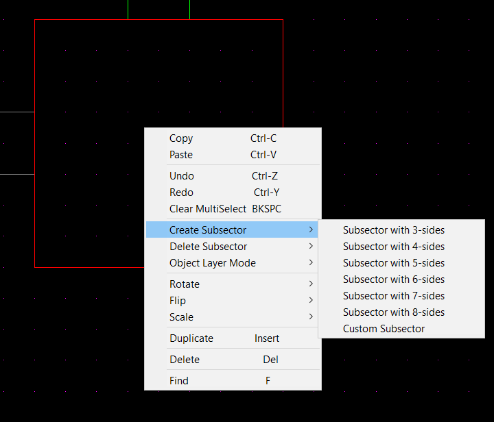
You can see that there is an option to Create or Delete subsectors . Go ahead and choose "Subsector with 6-sides".
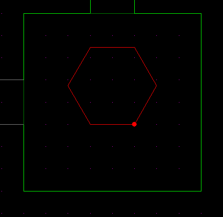
As you can see the tool created a hexagon. Go ahead and play with the subsector tool by giving it different floor and ceiling heights. You can always undo using CTRL+Z hotkey.
Sector and Wall Flag Options
Before we go to the next room you may notice that the next section is greyed out (Or you may not see it at all!)
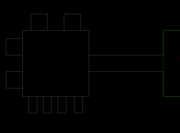
That's because these sectors belongs on a different layer. Go ahead and change to Layer 1 by clicking on the Layer arrow in the main menu or by holding Shift and using the MouseWheel.
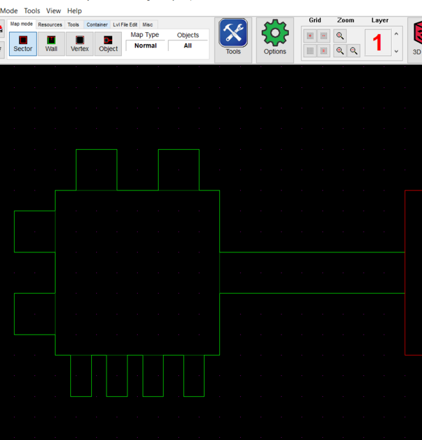
Now lets go to Room 7